 Pay My Bills
 Report a Problem
 Start / Stop/ Move Service
 Business
Usage Dashboard
OUC makes it easy to get details on your electric and water usage, and your electric demand. When you better understand your usage, you can make changes to reduce your bill. Log in to your myOUC account to access the dashboard 24/7.
Use Your Usage Data to Save Money
Identify periods of highest usage
Better understand your usage patterns
Make changes to reduce your bill
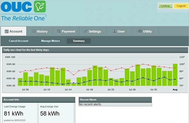
Access a Quick View of Your Usage
Review your daily usage along with high and low temperatures for the day, which can influence your usage.
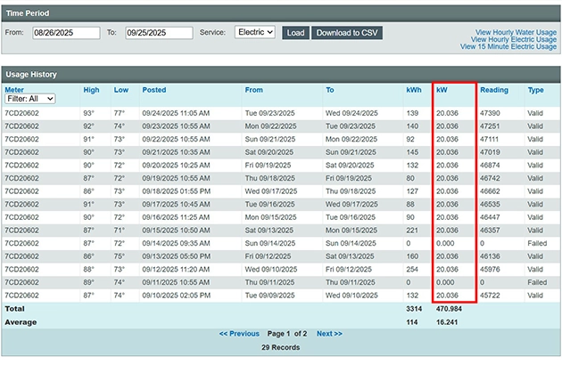
Compare Usage History
View your electric (kWh) or water (kGal) usage and peak electric demand (kW) for a custom date range. Focus on one service to clearly see usage patterns.
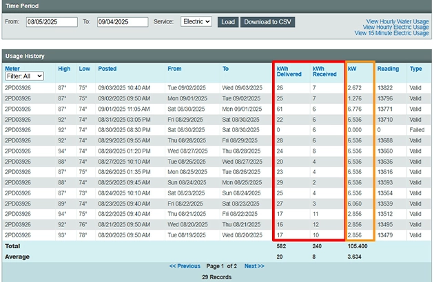
New for Solar Customers
Solar customers now have access to the Usage Dashboard and can see:
- kW – the highest amount of electricity used at one time during the past month
- kWh Delivered – electricity OUC provides to you
- kWh Received – electricity your system supplies back to OUC
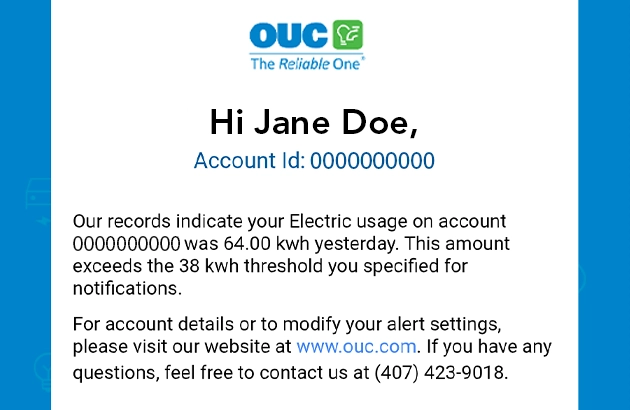
Set Up Alerts to Stay in the Know
Gain a better understanding of how much water or electricity you use by setting up Daily Usage and High Usage alerts.
The Daily Usage alert sends you a summary of the previous day’s electric and water usage, along with a 15-day comparison. A High Usage alert is sent when your daily electric or water usage exceeds the threshold of your choice.
Frequently Asked Questions
What is a kilowatt (kW)?
A kilowatt (kW) is a unit of power that an electrical device consumes at any given moment. A kW is used to describe appliance or home energy consumption or home solar energy systems. It is equal to one thousand watts.
What is electric demand?
Your electric demand is the amount of electricity being used at a specific moment in time. It is measured in kilowatts (kW). OUC records your demand in 15-minute intervals.
I do not see a ‘View Usage’ button on my myOUC account. Why?
If you are a new OUC customer, the Usage Dashboard will be available after the account is billed for the first time.
Some customers may not have access to the Usage Dashboard depending on their service type. You must be an OUC residential electric customer to access the Usage Dashboard. It is currently unavailable for customers with water-only service or if you are only subscribed to a specific program (such as District Cooling) or account consolidation.
Do I need to register for access to the usage dashboard?
No, you can access the Usage Dashboard from your myOUC account if you are an eligible customer. Simply click the ‘View Usage’ button on the Account Summary page to access the dashboard. Make sure that you have pop-ups enabled as the dashboard will open in a new window.
When I click on the ‘View Usage’ button, nothing happens. Why?
Our website requires the use of window pop-ups to launch the Usage Dashboard. Your browser may have a pop-up blocker feature enabled. Click the most appropriate browser to view your browser’s pop-up blocker settings.
- Safari: Block pop-up ads and windows in Safari
- Google Chrome: Block or allow pop-ups in Chrome
- Edge: Block pop-ups in Microsoft Edge
- Mozilla Firefox: Pop-up blocker settings, exceptions and troubleshooting
What is the benefit of seeing daily, hourly and 15-minute interval usage?
If you see spikes in usage at particular times or days, consider investigating the devices used during those periods. There may be an opportunity to be more efficient. If your usage is consistent throughout the day, consider looking at devices that run all day long, such as air conditioning, especially if no one is home during those times.
What are the red and blue lines/dots on the usage charts? What do the green bars represent?
The red line represents the high temperature for the day and the blue line represents the low temperature for the day. Click on the dots to see the actual high/low temperature for that day. Please note that the blue lines are only shown on the daily charts, not the hourly charts.
The green bars represent the kilowatt-hour (kWh) used per day. When you roll over the green bar, the number of kWh will be displayed.
When I click the link, I only see daily activity. How can I view hourly or 15-minute interval activity?
- Go to Usage History
- From your dashboard, click History.
- Adjust the Time Period dates as needed.
- Click the hyperlink for the data you want to view.
- Hourly Water Usage
- Shows temperature and water use (kGal) in hourly intervals for the previous day.
- Use the Chart link in the Hourly Usage table to update the view for a specific date.
- Switch weeks with the Next Week / Previous Week buttons.
- Hourly Electric Usage
- Same as water: hourly intervals for the previous day.
- Use the Chart link and week buttons as above.
- 15-Minute Electric Usage
- Shows temperature, kWh usage and kW demand in 15-minute intervals for the previous day.
- Use the Chart link and week buttons as above.
- Note: Only available for electric use.
How far back will the usage history be displayed?
The default display shows readings obtained during the last 30 days. Adjust the usage history time period as needed to align with your billing cycle.
Why do I have one day or several days with no usage and then so much the next day?
When the electronic reading for a digital electric or water meter does not communicate with our system for any reason (i.e. obstruction of the meter), that day’s usage is added to the next successful reading obtained.
Why are there large fluctuations in my day-to-day electric demand when nothing changes in my house?
The weather can have an impact on your electric demand because heating and cooling use large amounts of electricity. Even if your thermostat is set at the same temperature, your heating or cooling system will have to work longer to reach that temperature when the weather gets colder or hotter. You can see high and low temperatures when you roll over the red and blue lines on your Usage Dashboard.
Fluctuations in your demand may also be caused by other factors, such as the number of appliances used in your home at any given time. For example, if you use the clothes dryer, pool pump, and heat/cool your home at the same time, your demand will be higher. If you spread your usage out through an entire day, but do all your chores only in the evening on the next day, your demand will go up. This is especially true if you are running appliances like your washing machine and dryer.
My hourly usage shows the same reading all day. Is this reading estimated?
If the reading type is listed as Valid, then the reading is not estimated. If your account received a daily read but did not compile enough hourly reads, the system will take your daily usage and spread this over the day, making your chart appear to display the same consumption each hour.
What are failed readings and how will that impact my usage dashboard?
Your meter sends multiple readings daily, but occasionally a reading may not transmit—often due to temporary obstructions or communication issues. When this happens, the missed usage is included in the next successful reading, and the system marks the failed attempt as “Failed.” You can view these instances by navigating to the History tab on your dashboard. In the Usage History table, each reading is marked as either “Valid” or “Failed.”
How do I set up, cancel or edit my alerts?
Access the Usage Dashboard and click on the Settings tab to manage your alerts. Then, follow the steps below:
- Click on the blue button labeled ‘Configure Contact Methods’ to add your email address. You can add up to six email addresses, so be sure to give each entry a unique name.
- Click on the blue button labeled ‘Create Alert’ to get started.
- Select the appropriate options for the alert that you desire and save. For example, you’ll be prompted to enter your ‘Usage Threshold’ when setting up a High Usage alert.
- To edit or delete an alert, find the specific alert you want to modify and click on the ‘Edit’ or ‘Delete’ buttons.
Please note: If you respond to a text alert with STOP, all text alerts will be canceled. If you want to cancel, go to My Usage.
Related Content

About Peak Demand
Learn about peak demand and how it affects you.
Savings Solutions
Find out how energy efficient your home or business is and the improvements you can make to lower your bill.

Save Energy & Water Tips
Discover simple things you can do to conserve water and energy – and save money.
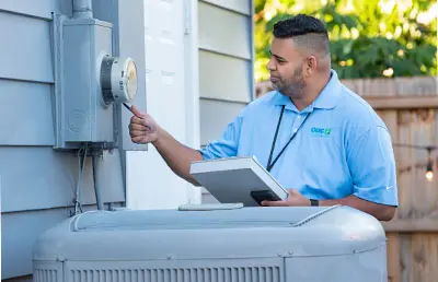
Digital Smart Meters
Learn how to accurately read your electric and water meter and use it to manage your usage.